Introduction:
Regular readers of this weblog will already know that some time ago, Jake was contacted by the Matchstick marketing company and asked to review a Microsoft Zune, seeing as he’s all important and stuff on the internets. He received his device and has since written three parts of his overall review, available here, here and here.
As part of the marketing offer, Jake was also given the opportunity to refer a friend into the program. I submitted an application, and received my review package a couple weeks ago. What follows here is the first part of my Microsoft Zune review, courtesy of Matchstick and Chatthreads.
Unpacking
The Zune arrived in a beautiful manila envelope, complete with super-lucky-deluxe-bubble-wrap on the inside that contained the slim, trendy looking box and some Matchstick documentation. The Zune box itself is pretty looking, a sure eye-catcher when placed beside an iPod box.
Oddly enough however, the sticker on the bottom of the box read “For Distribution in US only. Security Device Enclosed.” This immediately started me wondering – if this is a review program for a Canadian launch, shouldn’t I be reviewing the Canadian version of the product in question? Perhaps the two products are one and the same, but even so, a mistake like this could serve to alienate touchy Canadian consumers.
The securely packed Zune popped out of its box easily enough, but although the plastic wrapping on the device claimed that pressing the play button would turn it on, the Zune appeared to have been shipped without charge.
Continuing to unpack the box, I noticed the words “Welcome to the Social” emblazoned across the inside. Microsoft seems to be attacking the iPod from the social network community angle, which admittedly, is something that the iPod is lacking. We’ll see how that measures up later on.
The well designed ‘Start’ pamphlet inside instructed me to hit up the setup page to download the Zune jukebox software. I noticed that the other side of the pamphlet was written in Spanish, instead of the French that we are accustomed to seeing here in Canada. It’s a small detail, but again, it seems odd to court early-adopting Canadians with such obviously American packaging instead of taking the time and effort to ship a truly Canadian-branded product.
The Software
Installing
I went to the download page to get the Zune jukebox software and sign up for the Zune Social. If the social is anywhere near as engaging as the Xbox Live service, I could easily imagine it as a true iPod killing feature.
Unfortunately, upon arriving at the page and attempting to register for the service, I received an error message telling me that the Zune Social is ‘Not Available in Your Region. But please continue to check back with us in case we just so happen to decide to get our shit together for our Canadian Launch that is coming up on June 13th… Oh wait, that was one-and-a-half months ago. Huh.’ Guess we’re not killing any iPods today, folks.
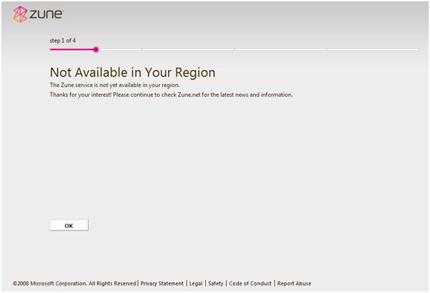
Later on in the day, I complained about this error to Jake (who also happens to be my roommate). He claimed that he had no trouble whatsoever signing into the Social, but that instead of attempting to register, he simply signed in with his Windows Live account that was linked to his Xbox Live profile. Going back to the registration page, I tried this workaround, and was immediately granted entrance. Check me out here.
Now in case I haven’t said it enough times already, I’d just like to re-hash my frustrations with the Zune program – not an hour after opening the envelope, and before even trying out the device. The Canadian launch of this product appears to have been severely fumbled. The device I received was marked for US sale only, the device documentation was in English and Spanish, and the Zune Social IP-bans registration for Canadian citizens unless you already have a Windows Live account that may or may not have to be linked with an Xbox Live profile. Here’s to hoping that the jukebox software and the device itself are in better shape than the launch effort.
The Collection View
The Software is Pink
The install process went smoothly, and I was soon looking at the main window of the Zune jukebox. It’s a pretty, though unconventional user interface. Since I’m not all that comfortable with my overwhelming masculinity, I quickly found an option to change the default pink background to a trendy and edgy greenish one complete with paint splatters and blades or something called Everglade.
I told the software to monitor my music folder, which at last count contains roughly 8500 pieces of media. Initial import of that folder took roughly 10 minutes, which I consider more than reasonable for the size of the operation.
Plugging the Zune into the computer emitted no immediate response of any kind, but there was an ultra-faint charging symbol displayed on the screen of the device. Unfortunately, it seems that neither my machine nor the Zune jukebox software will recognize the device during this initial charging phase. In that case, I guess we’ll begin by reviewing the jukebox software.
The Main UI
Once the import was complete, I started playing a song and noted that it sounded pretty good, even though there is no equalizer feature within sight. While unconventional, the user interface is interesting. The standard viewport on start up looks like this (honestly, I have no idea how that Jewel album got in there. Seriously guys):
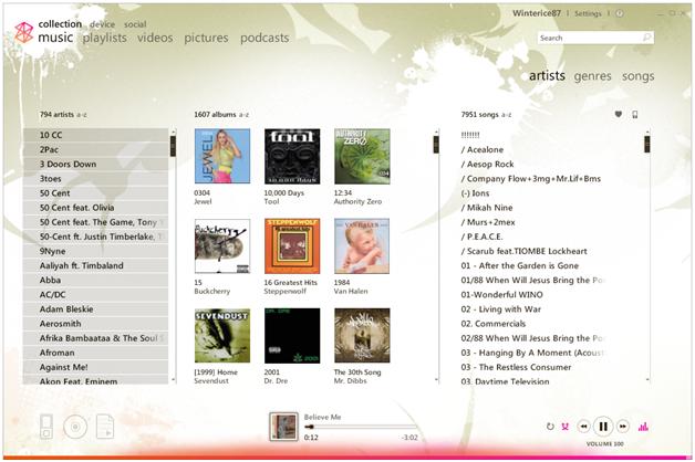
The first thing we notice here are the two view selectors. In the upper left corner, we find music, playlists, videos, pictures, and podcasts. The default is music, which has three additional view categories to choose from, namely artists, genres, and songs. It is important to note that all are in lower case letters, in case you forgot that the boys down in Redmond are in fact, trendy and cool.
The default view is artists, which gives a handy listing of all artists, all albums (complete with cover art), and all songs in the three columns. The Genres category yields a listing of the genres in your library, albums by artist, and all songs. Songs gives a listing similar to iTunes that includes the title, artist, album, and genre of each song in your collection. According to that view, there is a song in my music collection entitled “!!!!!!!” Allegedly it’s by the Roots. Huh. The things you learn.
Anyway, in any of these views, clicking on some entry in one of the columns brings up all the associated tracks in the other columns, which is pretty cool and very straightforward. Overall, the three views give a wealth of great ways to organize and find your music.
Unfortunately, perhaps my favourite and most used feature in iTunes, the five-star rating system, seems to be mysteriously absent from the Zune player. Instead, it gives me a useless yet trendy heart, no heart, or broken heart ratings system that was surely conceived by a 5-year old on a bad sugar trip. The lack of resolution provided by this rating system is sure to cause me headaches.
Aside – This just in, after a solid 30-minute charge time, the Zune came alive and connected itself to the computer. It seems that I need new firmware, the description for which is (this time) actually repeated in French. The update restarts the Zune and takes all of 3 minutes to complete. /Aside
Playlists
Switching over to the playlists view, I am informed that I do not have any playlists. This surprises me, as I know for a fact that there are quite a few m3u files in the music folder that the software is monitoring – admittedly, I don’t use m3u’s, as I long ago surrendered myself to the double-edged sword that is iTunes and stopped manually managing my music – but I do know that they are there, and wonder why they weren’t imported as playlists.
In any case, I am faced with two types of playlists, which seem to be static and automatic. The first works as would be expected. You can name the playlist and then drag and drop items from the music view into it with ease. Once inside the list, items can be reordered at will.
Autoplaylists are a little different. They are akin to the smart playlist feature of iTunes, if by akin we really mean ‘gimped to all hell and back.’ Unlike iTunes, which allows you to select multiple different rules for most any piece of metadata related to a song and separate the rules by either an AND or an OR statement, Zune allows you to select only from album artist, rating, genre, date added, year published, composer, and song plays. Furthermore, all the relations that you enter are linked by an invisible ‘AND’ statement, meaning that the rules quickly become limited in scope.
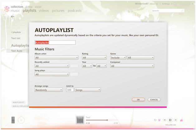
For instance, one could easily select all songs recorded by the Eagles, or all songs in the genre Rap, but it would be impossible to select all songs by the Eagles as well as all Rap songs, because the Eagles never recorded a rap song. That list would be empty and useless.
As an iTunes user, their smart playlist feature continually frustrated and annoyed me with its silly limitations, but the Zune version of the feature is far and away worse. I have a huge music collection that spans five decades and most every conceivable genre. In order to organize and find great songs in that proverbial haystack, I have become anal-retentive about ensuring that my meta-data is present and correct, and use smart playlists and star ratings indispensably. The fact that both a decent smart playlist system and any kind of granular ratings system are lacking from the Zune software are a huge turn off to me.
When testing other jukebox solutions that lack smart playlists, I have often grabbed the contents of one of my custom lists from iTunes and dragged them into a static playlist on the other player in order to at least have a list of songs that I feel like listening to while testing. Unfortunately, there is no drag and drop feature to the Zune player, nor is there an ‘import from software x’ feature, which could have been easily added, since iTunes can export its library as an xml file.
Aside – for anybody interested, I worked around this problem in true nerd fashion by hacking together a quick VB app that reads an xml file exported from iTunes and converts it to Zune-compatible zpl format (which is just a variant of the smil markup language). This program has allowed me to easily export all of my playlists from iTunes to the Zune player. If there is enough interest, I’ll put the app up for download. /Aside
These are small features that, while not immediately necessary, help to ease the transition between players, which is important if you’re trying to say, capture market share from a company that currently has over 80% of the worldwide player install base and the vast majority of mindshare amongst the general public. I feel that at this point, even if the Zune player had a better rating feature, I’d think twice about switching due to the simple fact that I’d have to wade through and re-rate over 8000 songs. That’s a lot of work and one huge deterrent.
Granted, if you’re just starting in the mp3 player field, have a music collection with less than 1000 songs, or aren`t as OCD about organizing your library, these missing features may not be a big deal. Perhaps I’m the outlying case here.
Videos
On install, I didn’t have any videos in my collection. Now as you may have gathered from reading Jakes weblog, our house is slightly different than most in the way that we manage our media. We keep a central server in our living room that holds all television and movie content in a central place. Being as we’re all movie lovers, we’ve ripped quite a few DVDs to that box for easy organization and viewing on the television, as well as network access from our other machines. It’s just the premiere way to share media among the members of a household, and prevents discs from being lost or damaged.
I decided to throw the Zune player a loop and try to add a folder full of video files from across the network, just to see how it would respond. After stalling for a minute or so, it started adding the files to the listing. Unfortunately, (and after some reading) I discovered that the Zune software only supports files encoded in WMV, MPEG4, and H.264 formats. As the vast majority of my content is encoded in XviD format, only a few were successfully imported. Watching local and network content in the player is easy and looks great, although the video player lacks a full-screen option.
It should be noted that there does not seem to be any option to add videos to playlists, or to make a separate type of playlist just for videos. However, if you select multiple video files and edit their information, you can assign them a TV Series tag, and enter a name and season number for that series. Then, when viewing videos by TV, they can be sorted into series.
Pictures
Adding pictures to the jukebox software is as simple as adding folders for the software to monitor. It automatically arranges them by the folder that they were found in, allowing you to keep your family vacation pictures and naughty adult pictures separate from one another.
Clicking on any picture in the collection starts a slideshow of all pictures in that folder. You can access and change your currently playing song from within the slideshow, although you are limited to the playlist or album that you are currently listening to. This is a really slick feature that far outpaces any comparable picture support in iTunes.
Podcasts
On import, the Zune software recognized all of the podcasts that I had downloaded from iTunes and sorted them into a separate section of the UI. They are arranged by Podcast title, and can be browsed easily, although you cannot put podcast files into playlists. On import, the software did not detect the URLs of any of my podcasts, although that is to be expected. The software does give the option to assign a URL to a podcast, allowing you to continue your subscription and pull up to date information from their website directly into the player. Overall, the podcast support seems to be very full-featured and quite a bit more advanced than that of iTunes.
Now Playing
Clicking the little bar-graph thing in the bottom right hand of the main window does not (as I had hoped) launch an equalizer, but rather, a now playing window that, while an interesting departure from the white and grey of iTunes, is almost as much of an eyesore as the myspace page of a 13 year old girl.
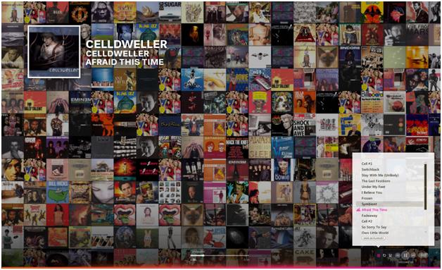
We can see my album covers randomly arranged in the background, with my currently playing song, playlist, and playback controls hovering above. I guess that this is the Zune’s answer to Coverflow. It’s awfully pretty, but probably not something that I would keep open on my display, strictly due to distraction value.
Search
This is a seriously cool and really easy to use feature of the jukebox software. If you select any list of song information within the interface and start typing, the software pops up a search box and automatically starts searching for the phrase that you’ve typed.
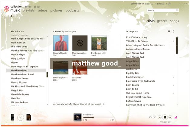
The search is fast and responsive, and not only finds the exact thing that you are looking for, but other possible hits around it that are related by some meta-data to the item in question.
Find Album Info
By far the best feature ever put into jukebox software. While in the artists view of the music section of the software, right-clicking on an album cover that is missing artwork and selecting ‘Find Album Info’ from the context menu launches a search for the missing album art and meta-tag information. The search almost always returns the requested album as the first hit, automatically replaces the artwork, and updates all of your existing meta-data with correct values.
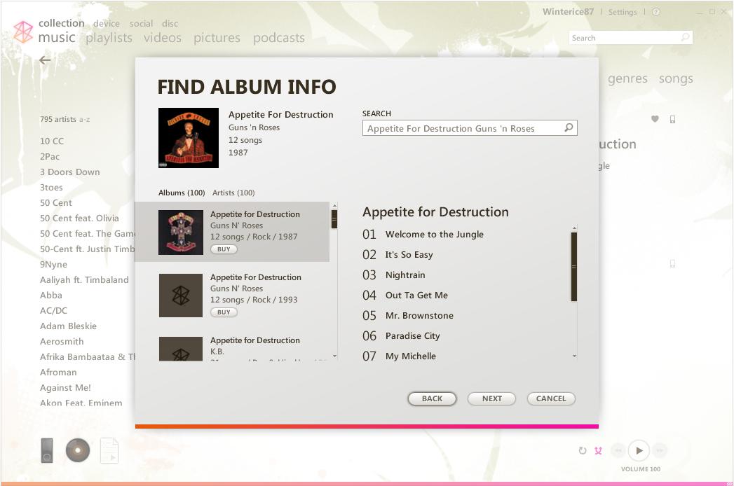
The only issues that I encountered with the feature occurred when trying to match up double albums – the database that the software reads from seems to treat double albums as two separate entities instead of one whole record. Otherwise however, this feature is incredible and something that iTunes could take a cue from.
Outro
Well, that concludes Part 1 of my Microsoft Zune review. To recap, this part included the unpacking and install process, as well as the Collection view of the Zune jukebox software. This view is analogous to the whole of iTunes feature set, and almost as good.
Overall, my first impressions of the Zune software are that it is very well written, and would be a serious contender to iTunes if not for a few pesky missing features such as a decent ratings system and improved smart playlists. Unfortunately, I also feel that the Canadian launch of the product was somewhat bungled, and could have been better handled.
Stay tuned for upcoming parts of my review, including the device, social, and disc portions of the jukebox software, as well as a review of the device itself.
Thanks for reading,
Jon
Update by Jake: This post was giving Internet Explorer a case of the bricks. I’ve removed some of the extraneous tags to make things display properly.
