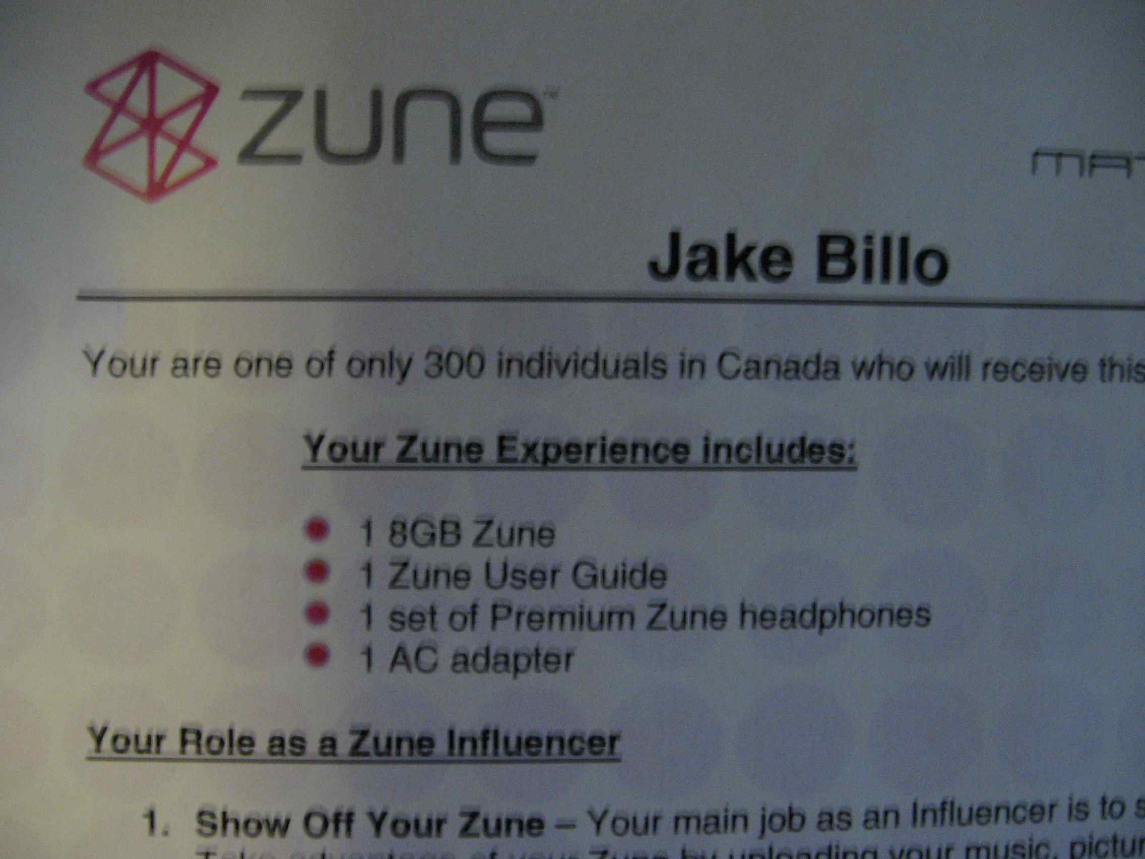
This post continues the Zune review series. I received the device for free as part of a Matchstick promotion. My goal is to provide a technically engaging and impartial review for people interested in MP3 players. Other posts include

From futility to mass-market?
One thing that always struck me about the Zune is how futile the first Redmond effort seemed: when it launched in the United States (and US only), the iPod was definitely entrenched and all the reviews basically said the same things. Microsoft didn’t build the player – they simply tweaked a Toshiba Gigabeat and ran with it. The software at the time was a pretty skin on Windows Media Player that didn’t use the same library.
From my initial impressions, much of that has changed. The Zune software, in its 2.5th iteration, still has a very unique interface that might appeal to indie kids – but it’s snappy and stands out on the desktop. The hardware feels well-built and has wireless synchronization: a feature Apple can’t yet match.
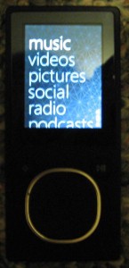
Hardware first impressions
Zune arrives in compact, Apple-style packaging, although the encased plastic skin is hard to remove and caused immediate smudging of the screen. Removing the device from its container wasn’t as obvious as the iPod Touch removal process. The back, metal enclosure has a nice tactile feel and should resist scratching: this solves a huge problem with the iPod classic models that causes resale value to plummet.
The device didn’t have any battery charge by default. After plugging it into the PC, a very faint battery indicator appeared – although I thought a USB port had failed since the device didn’t appear to respond right away. Switching to a different USB port fired up my hard disk, and the IDE activity LED told me that a device was being connected. The screen displayed on zero charge is so dim that I had to get confirmation from a friend that the Zune was actually showing something.
While I didn’t get an accurate time estimate on the total charge time, it took less than an hour for the Zune to become active. I’d peg the MP3 player as fully charged (from zero to 100%) after four to five hours.
While the Zune is attached to the computer, all controls are inaccessible and the device simply displays “connected”. Synchronization activity is displayed with a slightly inaccurate percentage indicator, which looks nice but seems to always stall at 84%-85% completion when new songs are copied to the unit.
Using the “squircle”, a touch-sensitive control pad, is intuitive and works as expected. You can either touch (swipe) or click up, down, left or right on its surface. In playback mode, these directions perform the usual actions required from a portable music player (volume up, volume down, previous track and next track). Other screens use the directions to navigate left, right, up and down. Clicking the centre of the pad activates the currently selected item.
The “back” and “play/pause” buttons feel firm and make a distinctive click when pressed. It’s definitely possible to use the device while it’s still in a pocket, although users may want to disable touch sensitivity if this is the primary means of use.
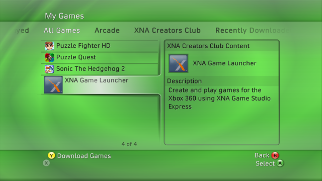
On the device, anyone familiar with the Xbox Live “twist” user interface will be pleasantly surprised.

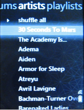
Categories, such as albums, artists and playlists are displayed across the top of the screen; items within that category can be scrolled up and down. The album browser displays a thumbnail of the associated image, and expand to two lines when highlighted, much like the active item in the “My Games” screen above.

(I don’t know how Avril got on there, or even why her pop-punk drivel is in my library. It’s definitely time to rate some of my music so this travesty can never occur again.)
The build quality of the device is excellent. Its solid construction and easy “gripability” provides a confident feel – I’m not concerned about dropping the Zune on the sidewalk or having it slip away from my grasp, unlike the iPod touch.
Audio quality on the unit itself is good, although the stock headphones leave quality to be left on the table. Using the premium headphones included with my review kit was a much better listening experience – they’re comparable to my favourite pair of Sony MDR-EX61 in-ear buds for audio range. The premium headphones also have magnetic backings so that they’re less likely to tangle in a pocket.
Compared to the BlackBerry 8320 that I’ve been using for basic MP3 listening on the bus, the Zune has a richer, more full bass sound on the same audio files. It’s definitely noticeable when switching from one device to another. This may be equalizer-correctable in the BlackBerry OS, but the software upgrade to OS 4.5 isn’t available on a wide scale yet. For now, my verdict is that the default Zune settings are quite good for standard music listeners.
More hardware details – such as FM radio support, podcasts and video playback will be detailed as I explore those features over the next few weeks. Here’s what’s ahead:
What’s impressed:
- Video playback appears to be smooth and looks great, even on the small screen.
- Support for FM radio is a unique feature that’s nice to have out of the box.
- The wireless synchronization works like expected without complaint.
What’s failed it:
- Slow performance when browsing the Pictures menu.
- Inconsistency in scrolling some menus: the wrap-around feature doesn’t work by touch.
- Overshooting artists and some other menu items by touch – reversing direction is not immediate.
Software first impressions
I’d already had the latest version of the Zune software installed, so there was no installation experience to speak of. To replicate the experience, I tried downloading and deploying it to a new Windows XP virtual machine – the process was fairly easy, barring the fact that running Windows Update concurrently caused the installer to fail. Finishing all the critical updates and rebooting the VM solved that issue, and the software installed without complaint. It’s hard to fault anyone but myself for that scenario.
I have all my music stored on a remote server, which isn’t a typical home user configuration but provides the most convenient way for my laptop and desktop to both use the same pool of media. Windows Media Player takes a long time to seek for the files, even over a gigabit LAN – and refuses to share content to my Xbox 360 without a series of long, painful permission changes.
Running the same process with the Zune software started badly. Windows Vista takes an inordinately long time (compared to Windows 2000, XP or any non-Windows OS) to enumerate all computers on the same workgroup. Simply expanding the Network icon started the hard drive churning – I switched over to My Computer, mapped a network drive with the direct UNC path to my files, and switched back to the Zune software before the process finished.
After selecting the “M” network drive, the import was quick and displayed albums immediately. Unlike Windows Media Player, the background process appears to have increased priority, letting users get started listening to their music right away. This snappiness is an excellent change and bests every other audio player but Winamp.
Ratings in the Zune software are either nothing, a complete heart for “like”, or broken heart for “don’t like”. During the import process, the library seemed to import some metadata for these files from Windows Media Player at the equivalence of five stars for the “like” rating. Without the granularity of a standard 1-5 (plus zero for unrated) rating system, it’s difficult to customize playlists appropriately.
More software features and functionality will be detailed in an upcoming review, since the software is what really makes the device shine. Here’s a sneak peek:
What’s impressed:
- The find album info feature is accurate, consistently good and fixes ID3 tags without complaint.
- Interface effects are well-designed.
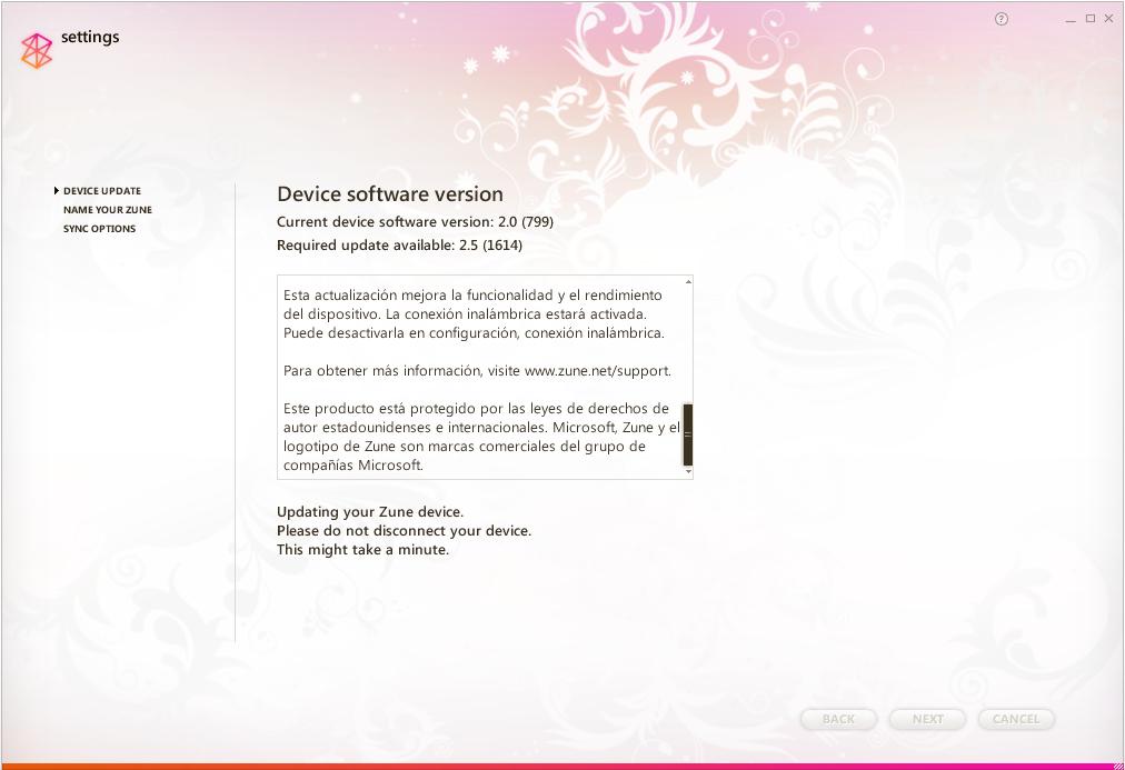
- When it comes to device software updates, the process is seamless:

What’s failed it:
- No mini-player mode, unlike iTunes or Windows Media Player 11’s toolbar. The equivalent is the Now Playing mode, which doesn’t offer album or artist sorting.
- Rating the current track involves switching to the “now playing” view. The collection also lacks a “go to the currently playing” command – Ctrl+L is one of my most-used iTunes shortcuts.
- Returning to a default view once you’ve filtered a search involves clicking from “artists” to “genres”, then back again. There’s no easy way to start at the default Collection screen again.
Social community first impressions
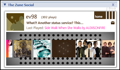
A large part of the Zune experience involves “the social”, which is a Windows Live ID-based system that assigns you a Flash-based card. The card displays a custom picture, background image, and recently played artists, and it can be embedded on other social networking profiles such as Facebook:

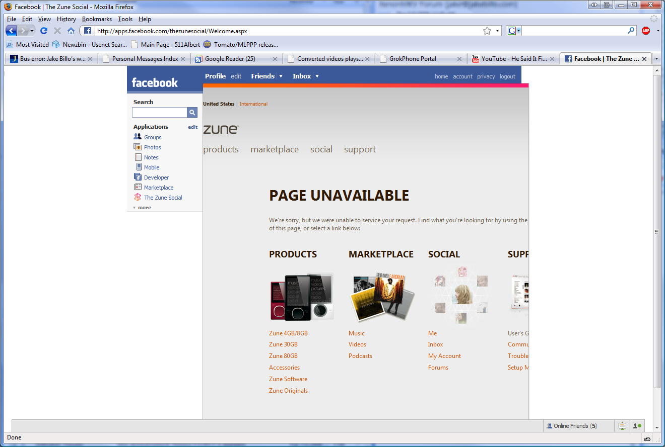
Unfortunately, the Facebook application is not always at its best:

When I clicked Sign In from the Zune software, it pleasantly surprised by displaying a list of all Windows Live Messenger accounts saved on the computer – a neat integration capability that you’d probably expect to see on a Mac. After providing the account password, I was prompted to accept updated terms of use through a browser, completely removing the immersive user interface experience. As per usual with Microsoft, the page redirected about four times and then attached to a Windows Live ID sign-in, which required the password yet again.
The next screen asked for some more personal information, most of which was already filled in the fields. A curious requirement was the Web site’s insistence on receiving a birthdate during signup. The information should already be present in my Windows Live ID account, but I’d have a hard time seeing why they’d need this detail: even complying with COPPA, they’d have known that detail when I initially attached my Xbox Live account to the Live ID. Overall, the signup seemed simpler than a comparable Apple/iTunes account, since Windows Live already had most of my information.
The final stage in the process launched the Zune software (even from Firefox) and prompted:
Did you know…?
Now that you have a Zune account, you can:
Join the Social, a beta online community where you can discover new music, share music with friends, and customize your Zune Card with your personal pictures and favorite songs.
Buy music and music videos and download free video and audio podcasts at Zune Marketplace.
Manage your account, configure privacy settings, and buy Microsoft Points online at Zune.net.
I was slightly offput to hear that the community features were still in beta, considering the software has already been through three major releases. Then again, the term “beta” these days seems to have been redefined to mean “lacks official support”.
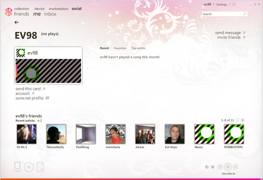
Activating the Social component for the first time, my account was activated with this garish, zebra striped card. It would have been nice if Zune would have imported my avatar from Xbox Live’s selection, since the zune.net default selection of profile pictures and backgrounds leaves something to be desired.

Notice those non-striped avatars at the bottom? Along with my Xbox Gamertag list, I seem to have picked up some “friends” who are definitely not the same people I know from Xbox Live. My initial assumption was that they must have been default Microsoft-assigned accounts, but wasn’t sure if they were alter aliases of Xbox Live friends. I ended up having to look at each of the new profiles to find out why I had friendship foisted upon me.
Looking at “DJ Ms E”‘s profile page on zune.net, all was explained:
This member of the Social is a Zune DJ. They’re automatically added to new members’ friends lists to get them started, and don’t count against your 100-friend limit.
It would have been nice to get more of a notification of who these additional friends were. Perhaps a badge or custom icon next to their profile image would have been a better cue than simply dropping them beside my existing Xbox Live friends. There’s also no way to remove these people from within the Zune interface – all remove requests are handled through the zune.net website.
It’s also interesting that this was the first time I’d heard about the 100 friend limit, and the limit includes Xbox Live friends. For people with distinctly different tastes in music and online gaming companions, I could see social butterflies easily running into problems here.
What’s impressed:
- The signup process is much less painful than I’d expected.
- Integration with Facebook is a nice touch.
- The Zune card appears to give badges or awards for listening to various types of music. Continuing along the lines of achievements is addictive and awesome!
What’s failed it:
- The Facebook application has occasional issues when clicking on the left-panel link.
- Horrible selection of backgrounds and avatars.
- Who are these people on my friends list, and why wasn’t I told about this earlier? And why can’t I remove them from within the application?
More impressions: marketplace, device synchronization and performance
What’s next for the Zune? I’m going to publish an in-depth look at the marketplace, syncing music and videos, and how well the software performs. Here’s a summary of what’s ahead:
- Marketplace: Not entirely there yet. Unknown error messages and content purchases just don’t work well. If content isn’t available in Canada, don’t display it!
- Music synchronization: Simplistic and easy – perhaps even too dumbed down. There’s no apparent way to fill the device with content, and autoplaylists are a shadow of Smart Playlist capabilities in iTunes.
- Performance: It’s a memory hog, but it’s only frozen once; all my data was saved out properly to boot. Zune beats iTunes hands down in this matter.
Be sure to check back soon for more impressions and thoughts – and maybe some more technical content!
